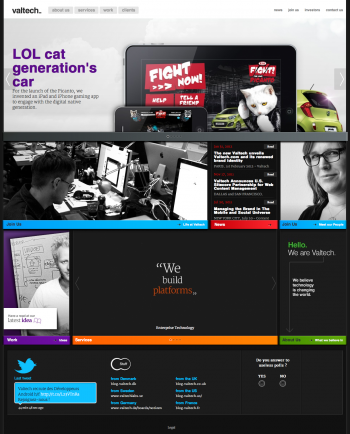
Yesterday was a big milestone and a step forward for us. We are Valtech. You knew this already. And now we do have a new corporate website, with a refreshed brand identity.

In case you didn’t notice, we also have a new brand identity. We have dropped the old (and agning) orange Valtech logo, and we have adopted a new visual identity that we internaly call “Beta”, not because it’s unfinished, but because it features a blinking command prompt after the brand’s name, and it suggest a work in progress, a perpetual reinvention. This brand identity was created by our colleagues from Valtech Denmark. Kudos Guys! ;)
Oh, and a last point: from now on, since I belong to the “Corporate” team at Valtech, I’ll be blogging both in French and in English. If you’re interested in only one language, or if you cannot read French you can just subscribe to either of the RSS feeds for posts in English or the RSS feed for posts in French. French posts and English posts will be different content. I don’t plan to produce the same content in both languages. Therefore you can just try a machine translation via Google, i you will.
Some posts may feature a short text in French and a piece of content in English (like a white paper or a video) and in this case those posts will be tagged French and English so you won’t miss content.

Good job!
You should also redesign the FR blog ;)
Hi Damien, thanks for commenting, and happy that you like it.
As you highlight it, it has now be done on the local sites. The first part of the job was about the “corporate” website, and by the way: I work in the corporate team. Then comes the time to roll out the new corporate identity to all our countries and agencies sites. It’s a work in progress, and this will happen over time.
Comments are closed.